The True Size Of – Accurate Country Sizes Beyond Mercator
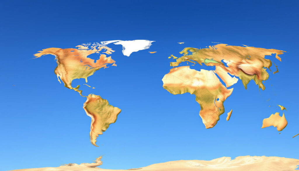
When first glancing at a world map, many people assume they are seeing an accurate representation of Earth’s landmasses. The reality is far more complex. The Mercator projection, developed in 1569, has shaped global perceptions of country sizes for centuries, often creating misleading impressions that persist in education and media. Interactive tools now allow users to drag countries across a map to reveal their true relative sizes, challenging long-held assumptions about how big various nations actually are.
Understanding true geographic sizes matters beyond mere curiosity. These distortions influence how people perceive international relations, economic power, and cultural significance. The gap between map appearance and reality becomes particularly striking when comparing equatorial regions with polar areas. Educational materials, news publications, and digital platforms have relied on Mercator-projected maps for generations, embedding spatial misconceptions into public consciousness.
This piece explores how map projections distort reality, what tools exist to reveal accurate sizes, and why these discrepancies persist in modern cartography. From the massive scale of Africa to the surprisingly modest dimensions of Greenland, the true size of countries often surprises even those who consider themselves geographically literate.
What Is The True Size Of?
The True Size Of refers to interactive web-based tools designed to demonstrate how traditional map projections misrepresent the actual surface area of countries. These platforms allow users to select nations and drag them across the map to compare their true relative sizes, revealing discrepancies that standard projections conceal. The most prominent tool, thetruesize.com, has gained significant traction among educators, students, and curious minds seeking geographic accuracy.
Tool Overview
Interactive map comparator enabling drag-and-drop country comparisons across different latitudes
Core Issue
Mercator projection distortions inflate polar regions while compressing equatorial areas
Popular Examples
Greenland appears similar to Africa despite being 14 times smaller in reality
UX Benefit
Direct visual overlay system showing real-time size adjustments as countries shift position
Key Insights on Map Distortions
- Africa spans approximately 30.37 million km², making it the second-largest continent, yet appears comparable to Greenland on standard projections despite the latter covering only 2.16 million km²
- Russia, the largest country by area at 17 million km², appears dramatically oversized near the North Pole but shrinks substantially when repositioned toward the equator
- Alaska seems roughly equivalent to Australia, though Australia is actually 4.5 times larger
- Brazil appears smaller than the United States on many maps, yet both landmasses are comparable in actual area
- Madagascar seems similar in size to Great Britain, though the island nation is actually nearly twice as large
- Europe, when viewed on Mercator projections, appears larger than South America, which contains more than double the land area
- Indonesia, despite being a fragmented archipelago straddling the equator, exceeds many countries that appear larger on traditional maps
| Entity | Perceived Size | True Size Context | Source |
|---|---|---|---|
| Africa | Similar to Greenland | 30.37 million km²; 14x larger than Greenland | Atlas.co, Wikipedia |
| Greenland | Nearly equal to Africa | 2.16 million km² | Terra Lab GIS |
| Russia | Massive, dominant appearance | 17 million km²; shrinks when moved equatorward | Brilliant Maps |
| Alaska | Comparable to Australia | Australia 4.5x larger; Alaska smaller than Brazil by factor of 5 | Wikipedia |
| Europe | Larger than South America | South America significantly larger in reality | Atlas.co |
| Madagascar | Equal to Great Britain | Nearly twice the size of Great Britain | Wikipedia |
How Does Mercator Distortion Affect Perceptions?
The Mechanics of Distortion
Gerardus Mercator introduced his cylindrical projection in 1569 specifically for marine navigation, prioritizing the preservation of angles and directions over accurate area representation. This design choice meant that straight lines, known as rhumb lines, remain straight on Mercator maps—essential for sailors plotting courses. However, the mathematical formula required to achieve this property progressively inflates scale as distance from the equator increases, making polar regions appear increasingly distorted.
The projection becomes effectively unusable for areas beyond approximately 70° north or south latitude, where distortion grows extreme. Despite this fundamental limitation, Mercator remained the dominant world map projection in educational and general-purpose contexts throughout the 20th century. Cartographers and geographers recognized these flaws early on, yet alternatives struggled to achieve widespread adoption until digital mapping technology made comparison tools more accessible.
Mercator designed his projection to serve sailors, not to represent relative country sizes. The preservation of compass bearings made it invaluable for maritime navigation, though this specific advantage becomes irrelevant when viewing static world maps for educational or reference purposes.
Historical Context and Modern Revival
Following Mercator’s original design, the cartographic community recognized the need for equal-area projections by the 1940s. Projections such as the sinusoidal, which Mercator himself used for depicting areas, and the Gall-Peters projection emerged as alternatives emphasizing accurate size representation. These alternatives, however, often distorted shapes in ways that some observers found aesthetically unappealing, which slowed their adoption in educational settings.
The 21st century brought a significant revival of Mercator-style mapping through Web Mercator (EPSG:3857), which became the standard for major online mapping platforms. This adoption stemmed from practical considerations: the projection enables efficient tile-based rendering, leverages existing developer familiarity, and introduces minimal distortion at city and regional scales where most users interact with digital maps. Critics including George Kellaway and Irving Fisher argued that continued reliance on Mercator-style projections for general-purpose mapping remains fundamentally unsuitable, particularly in educational contexts where distorted perceptions of national scale can take hold early.
How to Use the True Size Map Tool
Interactive tools like The True Size and Atlas.co provide accessible means to explore geographic reality beyond traditional projections. These platforms operate on a straightforward principle: users search for and select countries, then drag them to different locations on the map to observe how their apparent size changes based on latitude. When a country is dragged from its actual position toward the equator, its representation shrinks to reflect accurate scale; moving it toward the poles causes expansion.
To perform meaningful comparisons, select a country and drag it directly onto another country currently displayed on the map. The overlay system allows users to observe exact proportional relationships—such as how many times one nation fits within another’s borders when both are displayed at their true relative scales.
Alternative Projections and Tools
Beyond drag-and-drop comparators, several alternative projections and tools offer improved accuracy. The Robinson projection attempts to balance size and shape fidelity, while the Equal Earth projection, advocated by organizations like Correct the Map, specifically addresses the underrepresentation of Africa’s scale without polar exaggeration. Users can compare these projections side-by-side or through interactive sliders that shift between different projection styles.
No projection perfectly preserves shape, size, distance, and direction simultaneously—flattening a sphere inherently introduces trade-offs. The USGS and National Geographic frequently favor equal-area projections or globe views when accuracy takes priority, particularly for educational materials dealing with global statistics and international comparisons. Dynamic software and physical globes remain the only methods for experiencing true scale without compromise.
All flat map projections involve some degree of distortion. Interactive tools minimize this problem by allowing direct comparisons, but the fundamental challenge of representing a three-dimensional sphere on a two-dimensional surface cannot be fully eliminated. Even equal-area projections distort shapes and distances.
The Evolution of World Mapping
- 1569: Gerardus Mercator introduces his cylindrical projection designed for marine navigation, prioritizing rhumb line preservation over area accuracy
- 1940s: The cartographic community shifts toward equal-area projections for world maps, recognizing the limitations of Mercator for general-purpose geographic representation
- Late 20th Century: Gall-Peters and sinusoidal projections emerge as alternatives, though educational adoption remains limited due to aesthetic considerations
- 2000s: Web Mercator (EPSG:3857) gains dominance in online mapping platforms due to tiling efficiency and existing familiarity
- 2010s: Interactive comparison tools like thetruesize.com launch, providing public access to drag-and-drop country size demonstrations
- Present: Continued advocacy from organizations like correctthemap.org and increased integration of multiple projection options in mapping applications
Certainty and Uncertainty in Geographic Measurement
| Established Information | Information That Remains Unclear |
|---|---|
| Mercator projection inflates areas proportionally with latitude | Precise quantification of educational impact on geographic misconceptions |
| Africa is approximately 14 times larger than Greenland | Complete catalog of all countries significantly misrepresented on standard projections |
| Drag-and-drop tools provide accurate visual comparisons when used correctly | Standardized methodology for teaching geographic scale in educational settings |
| Equal-area projections exist as alternatives but involve shape trade-offs | Optimal projection selection criteria for specific use cases |
| Interactive overlays reduce uncertainty in perceived size relationships | Long-term effects of map distortions on geopolitical perception formation |
Why Accurate Geographic Size Matters
The implications of map distortion extend well beyond curiosity into matters of education, geopolitics, and international perception. When Africa appears comparable in size to Greenland, students absorb a fundamental misconception about continental geography that can persist into adulthood. This distorted view subtly influences how individuals perceive the relative importance of nations and regions, potentially shaping policy discussions, humanitarian priorities, and cross-cultural understanding.
Cartography experts consistently warn that these distortions create cognitive biases, particularly when embedded in educational materials used during formative learning years. The underrepresentation of equatorial nations—where much of the world’s population resides—can inadvertently diminish the perceived significance of these regions in global discourse. Addressing these distortions requires conscious effort from educators, publishers, and media organizations to incorporate accurate representations wherever possible.
Interactive tools represent a meaningful step toward geographic literacy, but widespread adoption of accurate mapping practices remains an ongoing challenge. Organizations including National Geographic and the USGS advocate for equal-area projections and globe-based instruction when teaching global geography, recognizing that true scale comprehension requires either three-dimensional representation or careful projection selection.
Expert Perspectives and Source Evaluation
Cartographers recognize that Mercator serves navigation extremely well but creates persistent misunderstandings when used as a general world reference. The challenge lies not in abandoning this useful projection but in selecting the right tool for each purpose.
— Cartography professional community, as documented in industry publications
No flat map can accurately represent the entire globe. Each projection involves deliberate trade-offs, and users should understand what a particular map is optimized to show rather than assuming universal accuracy.
— Geographic information science resources, including USGS educational materials
Reliable sources on geographic projection include peer-reviewed cartography literature, institutional resources from organizations like the USGS and National Geographic, and established reference materials such as the Wikipedia article on the Mercator projection, which carries a comprehensive citation network. The Atlas.co and Terra Lab GIS blogs provide accessible explanations grounded in cartographic principles. Researchers at the University of Michigan’s Quantitative Methods in Social Sciences program have documented specific distortion examples that illustrate the magnitude of common geographic misconceptions.
Summary
The true size of countries often surprises those who grew up viewing Mercator-projected maps. Interactive tools have made geographic reality accessible to anyone with an internet connection, revealing that Africa dwarfs Greenland by 14 times, Australia exceeds Alaska by 4.5 times, and many equatorial nations appear far smaller than their polar counterparts on standard maps. Understanding these distortions matters for geographic literacy and informed global perspectives. While no flat projection achieves perfect accuracy, conscious selection of mapping tools and continued education about projection limitations can help audiences develop more accurate mental maps of our world. Resources like The Great Pyramid of Giza illustrate how geographic context enriches understanding of world heritage sites and their significance within continental geography.
Frequently Asked Questions
Why does Greenland appear so large on most world maps?
Greenland sits near the North Pole, where the Mercator projection inflates areas dramatically. Its actual size of 2.16 million km² makes it roughly 14 times smaller than Africa, despite appearing nearly equal on standard projections.
What is the most accurate projection for comparing country sizes?
Equal-area projections like Gall-Peters maintain accurate relative sizes but distort shapes. The Equal Earth projection balances size and shape reasonably well. For absolute accuracy, globes or dynamic software remain optimal.
Can I use these comparison tools on mobile devices?
Yes, most interactive tools including thetruesize.com and Atlas.co feature responsive designs that function on smartphones and tablets, allowing geographic comparisons from any device with internet access.
Why do digital maps still use Mercator projection?
Web Mercator (EPSG:3857) enables efficient tile-based rendering crucial for smooth zooming and panning experiences. It also leverages existing developer familiarity and introduces minimal distortion at local scales where users typically interact with maps.
Which countries are most affected by Mercator distortion?
Nations near the poles—Russia, Canada, Greenland, Alaska, Scandinavia—appear significantly larger than their true dimensions. Equatorial countries including Brazil, Indonesia, and most of Africa and South America appear smaller than reality.
Is Africa actually the second-largest continent?
Yes, Africa spans approximately 30.37 million km², making it the second-largest continent after Asia. Its apparent size on Mercator maps does not adequately convey this scale, as the projection compresses equatorial regions.
Do schools still use Mercator-projected maps?
Many schools continue using Mercator projections, though awareness of distortion issues has grown. Organizations including National Geographic advocate for equal-area alternatives or globe-based instruction when teaching global geography.
Are there any countries that appear smaller than they actually are?
Most equatorial nations appear smaller than their actual size. Indonesia, which spans the equator as a fragmented archipelago, appears considerably smaller on Mercator maps than its true geographic footprint.
More related posts
 ASUS ROG Ally X: Specs, vs Steam Deck & Worth It 2025
 Cuba Gooding Jr.: What Happened, Net Worth, Wife, Movies
 Next OINP Draw Prediction 2026: Dates, Scores & Updates
 Cabbage Salad Recipe: Traditional & Variations Guide
 Love and Other Drugs – Plot Cast Reviews Streaming Guide
 29.99 USD to CAD – Current Rate and Best Conversion Tips
 Penticton Golf and Country Club – Membership Guide and Course Details
 Chuck E. Cheese Whitby – Address, Hours, Parties Guide